

Lots of people like to check out their HEMA rating; I know I always like having fun with data*. Most people tend to check out their rank, an ordered list of who is ahead of who. But that’s not the real story of HEMA Ratings. The real magic behind the curtain is the generation of a rating, after which it is really easy to rank everyone.
*There is of course a dark side. Getting over focused on the rating and having it suck out the fun of competition is a real thing that happens to people. And I’ve talked to individuals who let it seriously diminish their HEMA experience.
HEMA RATINGS Is About Rating
When two fighters meet in HEMA ratings they get a match outcome, and for now we will forget about anything like ties. This outcome is compared against the expected outcome, and the ratings are adjusted accordingly.
As we’ve seen in a previous article the estimated chance of victory depends on the ratings difference between the two fighters. If a fighter loses to someone with a much lower rating they lose a lot of rating, and if they win against someone close in rating they only gain a small number of ratings.

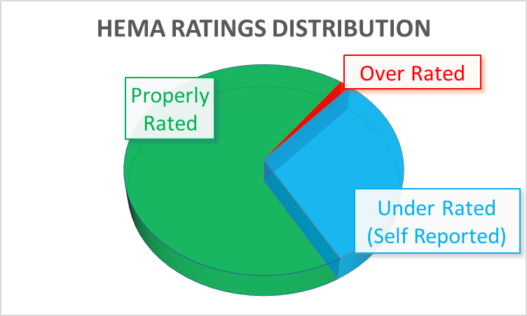
There are always some issues with the rating systems (What Can Go Wrong With HEMA Ratings), but on the whole HEMA Ratings gives a pretty good estimation (HEMA Ratings – Does it actually mean anything?). For every fighter that is grossly under/over estimated by HEMA Ratings, there are dozens of fighters with a fairly accurate assessment.
Uncertainty
The other aspect to the final rating in HEMA Ratings is the uncertainty. In addition to their score, each fighter has an uncertainty. This is based on how many matches, and is fairly easy to understand in concept. If a fighter has fought a lot of matches you have a pretty good estimation of their ability. The fewer matches a fighter has fought the more likely their score is a product of luck (be it good or bad).
The uncertainty is applied as a penalty on top of the score to get a final rating. In certain cases a lower scored fighter with low uncertainty can outrank a higher scored fighter with a greater uncertainty. The graph below is a little bit of an oversimplification, but it helps convey the general idea.

So What Is An Average Rating
Let’s have a look at the total number of rated fighters and where they fit in. We will start with longsword, like always. However this time I have enough data to work on a lot of different weapon sets, so once we get through the theory I’ll have answers for the other problems at the back of the textbook.

So what is average? To figure that out we have to go back to the dark days of grade school math, and revisit Mean, Median, and Mode.
The mean is what we typically think of when we hear ‘average’. This is found by adding all the values up, and dividing by the number of samples. If we want to figure out the mean number of times a group of people get hit in the head.

You might have noticed that the fighter on the right is really getting the crap kicked out of them. And it really skews the mean to a higher amount, as the mean of the first 3 fighters by themselves is only 1. Which is what the median is for.
The median is the number which is right in the middle of the range of numbers, and is often better in data sets where you can get extreme examples, either high or low.

In the example above, there is an extreme outlier who got hit twenty times, driving the overall mean up. If we used the mean as our average we would get a skewed view of how often most people were getting hit. The median is a better number.
The last of the three is the mode, which is defined as the most common number to show up in the data set. Also the mode.sngl function CRASHES MY EXCEL every time I run it on the HEMA Ratings data, so screw that measurement.
Final numbers for HEMA Ratings Longsword:

It’s close enough that I’m just going to use the mean for everything.
What Does ‘Normal’ Mean
Actually, normal can have several different meanings! Conventionally we tend to use it as somewhat of a proxy for ‘average’. Which, of course, means in technical terminology it is something completely different. In physics ‘normal’ means that two things are at right angles to each other. The ‘normal force’ is the force that is exerted normal (aka perpendicular) to a surface. So the normal force between your butt and the chair is the chair holding up your weight.

The other ‘normal’ we care more about is the normal distribution, more commonly known as the bell curve. This is the shape that natural populations tend to take. If you were to measure the height of everyone in your country it would form a normal distribution, nicely centered around the mean. In which case the mean and median would be equal. If the data is social rather than natural, such as the income of an individual, there will likely exist huge discrepancies on the high end which skew the mean away from a number representative of the typical individual. That is why people are always careful to use the more appropriate median number in their calculations just kidding, they use whatever method fits the story they are telling.
Is A Curve Normal?
The most powerful way I’m going to explore is the Shapiro-Wilk test. Which to an engineer like me is basically black magic that spits out a p-value telling you how close to a normal distribution something is. I’m going to start with the Open Longsword data, and then get to the others once we understand how it all works.
Using the magic algorithm on the Open Longsword data we get p = 5.7717e-21. Which means that given the number of datapoints I have there is a 0.0000000000000000006% chance that the Open Longsword data is actually normally distributed and it’s just a trick of randomness it doesn’t perfectly fit the normal distribution. (5618 data points is a pretty big sample size to be sure of something).
Which raises an interesting question: why? To dive deeper there is a another powerful statistical tool that can be used: the Q-Q plot. And this is something I have absolutely no experience using.
Stats Plots: Cry More
[Kari Steps In To Explain]
Sean is in a little over his head, so he called in the big guns to talk about this next part. I guess this is the punishment I deserve for showing him cool stats things that he wants to use in his articles, but doesn’t exactly know what’s going on. Anyway…
As mentioned above, the data for longsword HEMA Ratings does not follow a normal distribution, aka a bell curve. Sure, it looks close enough when plotting it, but it’s a little off.

We can analyze what’s going wrong by looking at something called a Q-Q Plot. The “Q” means “quantile”, and basically it compares the actual quantiles of the data with the theoretical quantiles of a normal distribution. A quantile is a division of the data at equal points; a good example of a quantile is the percentile, where the data is broken up every one percent. For a normal distribution, the quantiles are broken up by the standard deviation of the data. Normal distributions have a unique property where when the data is centered on the mean, 68% of the data falls within plus-or-minus one standard deviation of the mean, 95% within two standard deviations, and 99.7% within three standard deviations. Because of this, we know exactly where the data should fall in comparison to the standard deviations for perfectly normally-distributed data.
The Q-Q plot for longsword looks like this.

Those “Stats Black Magic Numbers”* are actually standard deviations, and the red line represents where all the points should fall if the data followed a true normal distribution. With this, we see that, especially toward the left side of the graph, the data does not fall along the line. If you look back at the previous chart, you can definitely see that the data toward the left side of the graph is not following the conventional bell shape. What this Q-Q plot is telling us is that the lower HEMA Ratings in the “tails” of the graph are under-represented if we are considering a normal distribution, which also means that these folks who should have lower ratings are being pushed more toward the center of the ratings. We also see a slight dip toward the right side of the graph, meaning that we also have a small under-representation of highly-rated fighters.
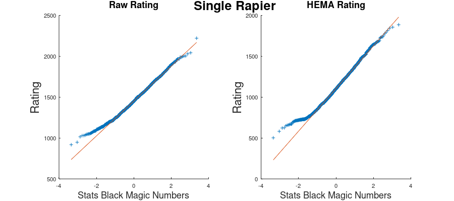
In addition to the standardized HEMA Rating, there’s also the raw HEMA Rating as well. That looks like this:

What we see here is very similar for the left tail of the graph, but the right tail is going in the opposite direction. This still means that lower HEMA Ratings are under-represented in the data, however higher HEMA Ratings are now being over-represented. The method used to standardize the ratings in the first graph shifts people to a more “average” rating than what it would naturally be underneath the raw rating.
*Sean created these graphs, not me. I take zero responsibility for them.
Other Weapons
We have data for all the other weapon categories on HEMA Ratings, so let’s take a look at them. I’ve put together a handy-dandy matrix for how to interpret the different tails of the graphs:
| Above the Red Line | Below the Red Line | |
| To the Left of 0 | Lower-Rated Fighters are Under-Represented | Lower-Rated Fighters are Over-Represented |
| To the Right of 0 | Higher-Rated Fighters are Over-Represented | Higher-Rated Fighters are Under-Represented |


For the most part, the ratings are under-represented when we get to the extremes of lower-rated fighters and higher-rated fighters regardless of if we look at the raw rating or the standardized HEMA Rating. This is especially true for the lower-rated fighters.
This paints a very interesting picture. Being that both the higher and lower ends are under-represented, this means that more fighters are closer to the “average” fighter than there should be under a true normal distribution. In other words, fighter skill is often closer together than we might initially assume. The idea that lower-rated fighters are particularly under-represented means that there are far fewer people who truly suck at the sport than we might imagine (at least of those practitioners that participate in tournaments anyway).
What Does It All Mean?
[Sean Steps Back In]
And now that I’ve had a real expert explain what is being shown, let’s see if we can figure out why it is happening.
The strongest, and most common feature of all the distributions is that there are fewer fighters at the bottom than we expect. And by ‘expect’ we mean ‘less than we would see if it was a normally distributed population’. But remember when I said earlier that social, rather than natural, populations tend to break rules of normal distributions? This is one of those cases.
In order to get to the very high end you either need to:
- Fight in a lot of matches, and show you can consistently maintain 50-50 win/loss ratio against the top rated fencers, and a positive win/loss ratio against high fencers. (100+ matches)
- Fight in fewer matches against decently high-rated individuals but have an astronomically good win/loss ratio. (30+ matches)
The former takes a long time, hundreds of matches typically, and many years. The latter can happen pretty quickly. Note that only a few losses will cause the rating to come crashing down equally fast. And even though it’s in theory possible to get up to the top really quick, you can’t exactly do it without having a pretty good base of skill.
On the other hand, to get to the very low regions you have to have to:
- Fight in a lot of matches, and show that you are consistently losing against low rated fencers. (100+ matches)
- Fight in a smaller amount of matches against very low rated individuals and lose them all. (30+ matches)
From an overall rating point of view 30 matches isn’t a lot to get a good picture of overall ability, but even 30 matches is a lot if you are getting horribly crushed every time. A simple explanation for this is that people simply stop fighting in tournaments if they are doing so badly they would fill out the bottom end of the HEMA ratings bell curve.
I did a quick sanity check of this, and it matched my expectation. I randomly sampled 10 of the bottom 30 rated Open Longsword fighters and none of them had more than 8 matches fought (all losses of course). So this explains why we have the lower part of the curve cut off.
Why do some people who lose all their matches end up with lower scores than others? It mainly has to do with who you are losing to. If a noob goes into a tournament and fights all advanced people their rating doesn’t go down much, because all that it shows is they are worse than really good fencers. So they could just be a mediocre fencer who got unlucky pool draws. If a fencer is matched against all very low rated fencers and still loses then the algorithm will determine that they probably aren’t very good, and will drop their ranking significantly.
Where Is The High End?
I don’t have a convincing explanation for why we (generally) see a more truncated high end, and it’s not something that is as provable. In order to get higher and higher in rating you generally need to fight people who are also highly rated, and win. You can do it fighting lower rated individuals but it takes a loooooong time, and we only compete so often. While the phenomenon of people being overrated in their local islands is well known, it also has a downside.
If the population of the island is small it can often be hard to get a rating above a certain point. In order for people to catapult themselves up using the island effect you have to have the island produce multiple highly rated fighters, and then have one fighter be dominant above these highly rated individuals. But if there are no other highly rated individuals in this desert island then there is a limit to how high an individual can grow. And that is my best guess as to what is happening here. Please note that there is absolutely no proof for this and I’m mainly advancing a guess.
Conclusions
You’ve been waiting all this time for me to tell you what the middle of the pack is for HEMA Ratings in each weapon. Here it is.


| # Rated | Mean | Median | Standard Deviation | |
| Open LS | 5618 | 1093 | 1072 | 249 |
| Women’s LS | 664 | 1086 | 1068 | 256 |
| Rapier & Dagger | 1185 | 1097 | 1083 | 251 |
| Single Rapier | 1229 | 1114 | 1100 | 246 |
| Saber | 1601 | 1106 | 1094 | 244 |
| Sword and Buckler | 1457 | 1106 | 1083 | 255 |
| Sidesword | 475 | 1076 | 1062 | 248 |
| Singlestick | 694 | 1088 | 1059 | 246 |
Stuff For Nerds
If you really want to nerd out you can read the full justification of the Glicko-2 algorithm, by Professor Mark E. Glickman. Example of the Glicko-2 system