

I plan to write at least a few more articles for SwordSTEM, and I realized that some of the topics might require a little bit of background if people want to understand the techniques I use while creating predictive models. Instead of trying to cram a ton of content into the individual articles, I’ve decided to take the time to write up a reference primer on some of the more popular predictive modeling techniques. This article is meant to be very high-level, so it will go over general cases rather than being pedantic and nuanced. If you are interested in learning the finer details of predictive modeling, I suggest looking at my favorite STEM blog second favorite STEM blog, Towards Data Science; this website is especially fun for those of you that would like to learn how to code predictive models as it is chock full of Python examples. Towards Data Science taught me more than grad school ever did.
Fair warning: you will not learn much about HEMA in this article because most of the examples are made up. Instead, the made up HEMA examples will help you learn about predictive modeling.

What is Predictive Modeling?

Predictive Modeling is a term for a broad set of techniques used to take data about the past and present to make predictions about the future. The things we can try to model can take all different forms, with some examples being the number of doubles in a match, when a sword will break, or who will be the winner of a tournament. These types of variables are called outcome variables, predicted values, y, or dependent variables. They are predicted by the use of input variables, predictor values, x, or independent variables. For example, predictor variables for who would be the winner of a tournament could be their HEMA Rating, their opponent’s HEMA Rating, the number of years they’ve been in HEMA, which club they belong to, if they are traveling for the tournament, if they ate a donut beforehand (you’d be surprised by the things that have impact on a match, and I’m very convinced of the power of a pre-fight donut). The key thing to keep in mind is that the predictor variables used must be variables you have insight into before the event you want to predict occurs; for example, you would have to use a competitor’s HEMA Rating from before their match to predict the outcome rather than their HEMA Rating from after their match, as the outcome of the match directly impacts the HEMA Rating.
Linear Regression
This is one you may have heard of before, probably because there have been some previous SwordSTEM articles which talk about regression. Linear regression models are used to model data with continuous outcomes. Examples of continuous variables are things like height, weight, temperature, and percentages. It relies on seeing if there is a relationship between variables that can be explained by a straight line. This can be done with one or more predictor variables; using one predictor variable is called Simple Linear Regression, and using multiple predictor variables is called Multiple Linear Regression. Simple linear regression is the easiest to explain and can be visualized on a 2-dimensional plane.
We have two different popular materials for longswords: synthetic and steel. We know that these weapons can break if certain conditions are applied to them, for instance, being exposed to extreme temperatures. What if we looked at if the maximum temperature a weapon is exposed to can predict how long it will take to break? We would see something like this:

The first graph could easily be placed into a linear regression model and have high predictive value, whereas the second one would not fare very well in a linear regression model. This means that for a synthetic longsword, the temperature it is exposed to does have an effect on its longevity, whereas it doesn’t matter so much for a steel longsword.
Linear regression will put a line of best fit to the data. Because statisticians are a bit uncreative with naming, a line of best fit is pretty much what it sounds like. It places a line on the graph that best explains the relationship of the data by minimizing the difference between where the points are on the graph and where the line is located. It does this through a method called ordinary least squares; you may actually see linear regression referred to as Ordinary Least Squares Regression or OLS Regression. The line of best fit looks like this:

Linear regression will produce an equation for the line of best fit (also called a regression line) in the form of:
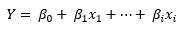
If you think this looks familiar, you’re right. You likely learned about slope-intercept equations in high school geometry:

This is very much the same sort of idea. In the case of simple linear regression, it will look exactly like slope-intercept form, with one intercept, one slope, and one x variable. You plug in your x value– or predictor variable value– to estimate y– or your prediction value.
The really cool thing about the slopes for a linear regression model is that they can tell you how much a specific variable affects the outcome. For example, the synthetic longsword regression line has the following equation:
Time to Synthetic Break (days)= 1000 – 1.5*(max exposed temperature)
With this very basic equation, we can see that the baseline number of days for a synthetic to break is 1000 days and that each degree in temperature the sword is exposed to will decrease the lifetime by 1.5 days. From this, we can make the educated decision against leaving our synthetics in the car in the 110°F Arizona summers. If we wanted to turn this into a multiple linear regression problem, we could also add in things like which company makes the sword, how much you bench press, how many pre-match donuts you ate for extra energy…
This predictive modeling stuff is pretty easy, right?

Poisson Regression
Next up is Poisson regression; if this is something you haven’t heard of before, that’s ok! It’s also beyond the limit of Sean’s statistics knowledge. Poisson regression is a type of Generalized Linear Model, or GLM. It is a bit similar to linear regression, but at the same time quite different. Linear regression is used when the data is continuous and expected to be represented by a linear relationship. Poisson regression is used with a special type of numerical data and is expected to be represented by a Poisson distribution. The type of numerical data that Poisson regression uses is count data. This would be things like the number of competitors at various tournaments, the number of swords broken by individual students in sparring practice, the number of crushed fingers at an event (idea: see if allowing lacrosse gloves for steel longsword tournaments is a good predictor), etc.
Though all of the above examples could theoretically be modeled by linear regression, looking at the distribution can tell you whether it is more suited to a Poisson model. Stealing from Wikipedia, a Poisson distribution can look like any of the following:

Nerd moment: this chart represents a probability mass function, and they are pretty cool to learn about if you’re into the theoretical side of statistics.
One example that we can look at is the number of doubles in tournament matches (this one actually uses real data!):
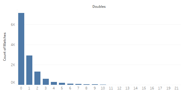
Notice how it looks somewhat similar to the yellow-dot example from Wikipedia, so this would be a good contender for creating a Poisson regression model.
Similar to the linear regression, the Poisson regression model will have an equation that goes along with it, except it looks a little more complicated than the linear regression one:

This equation does have some of the same elements as the linear regression, so you should understand that it is similar in nature. For the interpretation, you have to think of it in terms of e and log. This isn’t super important for you to have a good grasp of, just keep in mind that a change in the predictor variable is equal to a change in the logarithm of the predicted count.
Logistic Regression
Logistic regression is another type of GLM, however the kinds of things that you can model with it are quite different from the numerical metrics we’ve looked at with linear and Poisson regression. Logistic regression focuses on questions like: will the next hit be clean, will the competitor follow the next semaphore correctly during cutting, will the competitor wear shin protection. Those sorts of yes/no types of responses are called binary classification responses; they are translated into 1 or 0 values for the logistic regression model. For example, 1 would be a “yes” answer to the question (they will cut the next semaphore correctly) and 0 being the “no” answer (they will not wear shin protection 😬).
To explain the details of the logistic regression model, let’s take a look at the equation that describes the model first:
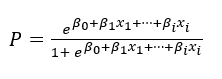
If you look at this closely enough, you might notice that this probably will not return a 0 or 1, but rather a decimal in most cases. This is the probability of the observation belonging to the 1 class.
Let’s explain this a little better with a concrete example. Let’s say that we want to predict if you will make a clean cut on a tatami mat by using the number of times you’ve successfully made the cut on a water bottle as a predictor variable. We might have something like the graph below. (Whereas Sean likes to do his charts in PowerPoint, I do mine in MS Paint, so pardon my sloppy free-hand drawing).
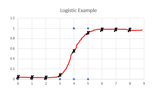
This line is produced by something called a sigmoid or logistic function. The y-axis is a probability, which is what you will get when you put an x value into the sigmoid function. To interpret this graph, we need to consider the blue dots and the black crosses. The blue dots are the actual values, and the black crosses are the predicted values. If your actual value is between 0 and 3, you will have a predicted value of 0. Once you get between 3 and 5, your predicted probability is between 0 and 1. Once your actual value is greater than 5, your predicted value is 1.
Though some applications of logistic regression will use the probability as-is, others will want to categorize the output as purely 0 or 1. In this case, we will use something called a decision boundary.
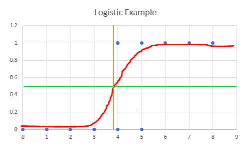
The green line here at .5 represents a decision boundary. If the probability indicated by the red line shows a probability above .5, then the outcome can be categorized as a 1. Below .5, and it is categorized as a 0. For this example, the decision boundary occurs just before 4 on the x-axis, which is represented by the orange line. This means that anything to the left of the orange line will be classified as 0, and to the right would be classified as 1. As we can see with two of the data points, this model does not necessarily classify everything correctly.
Decision Trees
Decision trees are a predictive modeling method for classification of outcomes. What this means is that an object will belong to a specific class of a category; for example, we can have the category of “Tournament Types” with classes like “Longsword”, “Rapier”, “Singlestick”, and “Saber”. We can also classify binary outcomes, such as any of the examples mentioned in the logistic regression section.
Decision trees are easiest to explain when we are only dealing with binary outcomes; to help explain decision trees we will consider the following scenario.
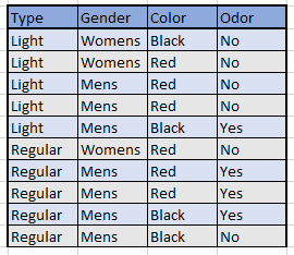
You’re waiting for your new SPES jacket to arrive in the mail. It can take up to two months to be made and delivered, which is quite a long time to not be sparring. Luckily, your club has loaner jackets for you to borrow! However, they don’t get washed very often… perhaps never… so they have a chance to have things like donut frosting stains and body odor. Now, remember, it’s COVID times so once you touch a jacket, you can’t put it back to avoid spreading germs, so you have to figure out which jacket has body odor just by visuals.
We have the following table describing the loaner jackets:
We will use a decision tree to figure out how to determine which jacket you should pick in order to maximize your chances of getting one that doesn’t reek. Here is what the decision tree looks like:

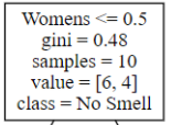
Let’s explain what this tree means by using this small part of the decision tree:

The top-most box is called the root node, which is where your tree starts. It will create branches (6) based on a true/false split until it gets to the lowest levels, which are called leaves. The true/false split is based on the node’s condition (1); in this case the condition is “True if Women’s is less than 0.5 and False if Women’s is greater than 0.5”. In this case, Women’s is a binary variable, so if the jacket is a Women’s Jacket, it will be false and if it is not a Women’s Jacket, it will be true. The value (4) tells you how many of each Odor Type there are in that node, with the first number being No Smell and the second number indicating Body Odor. Lastly, the class (5) will tell you how the jacket would be classified if the decision tree stopped at that node. For the root node, it would classify as No Smell because there are 6 No Smell jackets versus 4 Body Odor jackets. However, in the left split, it would classify the jacket as Body Odor because there are more of that type in that node. We will talk about the Gini Index (2) in just a little bit. But first, remember the code words “Fluffy Llama”; you may be rewarded for it in the future.
Based on the original decision tree, we can make some rules about the jackets. To make things simple with the decision tree rules, let’s remember that Womens <= 0.5 is Mens, Regular <= 0.5 is Light, and Red <= 0.5 is Black
- If the jacket is Women’s, then No Smell.
- If the jacket is Men’s, is Light, and is Red, then No Smell
- If the jacket is Men’s, is Light, and is Black, then Body Odor
- If the jacket is Men’s, is Regular, and is Black, then No Smell
- If the jacket is Men’s, is Regular, and is Red, then Body Odor
There are two things here I would like to point out. The first is that the Men’s-Regular-Black category does not actually have all the jackets in the No Smell category, as indicated by the [1,1] value. This is what we call an impure leaf node. The decision tree does not have any other variables to use to try to break it down further, so it assigns that leaf the majority class (or, in this case, at random because they are equal). The second thing I want to talk about are the Red jackets. Unlike other types of models which will only say that Red jackets are indicative of Body Odor or No Smell, the decision tree allows for certain cases where the Red jackets contribute to Body Odor and other cases where the Red jackets contribute to No Smell. In this case, whether or not the Red jackets are smelly depends on if it is a Regular or Light jacket.
Remember when I said I’d explain what the Gini Index (2) is? Now’s that time. If you’re already starting to feel a bit overwhelmed, feel free to skip to the next section because this one will get a little math-y. The Gini Index is one way for the model to determine how to split a decision tree. It is based on the following formula:

What this is saying is that you take the sum of the squared probabilities of each class in a node and subtract it from 1. We can use the first node of the tree as an example for you to see it in action:

What does this number tell us? Simply put, it tells us that the classes are almost evenly split in this node, which is explainable by the fact that the values are 6 and 4; if it was a 5-5 split, then the Gini Index would be exactly 0.5. If the Gini Index is higher than .5, it means the mix of classes is very random. If the Gini Index is 0, it means that there is only one class present in the node. We can use the following pictures to explain this better.

The left is a picture of my synthetic sabers being used as wall art. This would have a Gini Index of 0 because they are the same type of weapon. The middle is a picture of Mordhau’s sword storage. This would have a Gini Index close to 0.5 because there’s a pretty even split between the synthetics and the boffers. My husband’s weapon bucket on the right, however, would have a Gini Index close to 1; notice how there are multiple axes, a couple boffers, a synthetic longsword, and various other miscellaneous weapons all precariously thrown into this bucket.
Now let’s explain how the Gini Index is used to determine splits. Basically what happens is that the decision tree will look at every possible split and determine the Gini Index for each set of branches, which can sometimes be hundreds of splits; in our jacket example, there were three different choices for the first split (regular-vs-light, men’s-vs-women’s, or red-vs-black), two for the second split (whichever two are leftover after the first split), and one for the third split. Because the idea of a decision tree is to make every branch have just one class in each leaf node (all No Smell or all Body Odor), the algorithm will look at the split choice that has its Gini Index closest to 0.
Ensemble Methods
The last type of model that we will talk about is called an ensemble method. Ensemble methods have many variations that would take a long time to explain. If you want to read about all of them, you can visit Towards Data Science. I will focus on one specific type of ensemble method, which is classification based on voting, because that’s pretty much the only one I’ve ever used. This type of ensemble method is very easy to explain– probably the easiest one in this article.
Imagine that you’ve created different types of models to try to predict the same thing. Maybe they are different model types (such as a decision tree and a logistic regression model), maybe it’s the same type of model but with different variables being used as predictors (such as using first hit to determine match winner in one model versus using HEMA rating to predict a match winner in another model), or maybe it’s a mixture of both. What an ensemble method does is count up how many models resulted in each class and chooses the class that appears the most. We call this voting– the prediction with the most votes wins. Though ensemble methods tend to have better performance than each individual model alone, having the most votes doesn’t always mean it’s the correct answer.

Serious aside here– if this happens in favor of your opponent in a match, don’t be a jerk about it. Judging is hard stuff and greatly underappreciated. If you think you can do better, I’m sure the event staff would be glad to have you as a volunteer judge.
You’re Done! YAY!
And that’s it for predictive modeling techniques! At least the basic ones that I’m able to explain without making your eyes glaze over. Speaking of glazed, I’ll buy donuts to share with the first six people at a sword fighting event who mention the secret phrase hidden somewhere in this article, because donuts are the ultimate fighting food. Hope you didn’t skim the article!
